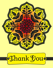
 I really like the way that the watercolor technique allowed me to color in an image with more variation than piecing punched shapes behind a stamp had allowed me. I wanted to try another card, and the Medallion image from the Day of Gratitude stamp brush set seemed like a good option. It has a lot of play between the stamp image and the background that seemed suited for watercoloring.
I was impressed with the color spectrum paper that Heather Summers created for her contest cards, using the color swatch option in the color fill section. Her video explains the process better than I ever could:
So I put the two ideas together in my card. As I had done on the Thanksgiving Watercolor card, I stamped the Splatter from the Extreme Elements set to build my watercolor pattern. I choose colors from the color swatch option in the color fill section as Heather did, but I didn’t follow up the rows. I picked and choose nearby colors that fit the pattern I was going for. It took dozens of stamped images in layered concentric arcs to fill in just one section of the medallion.
After I filled in four of the sections, My Digital Studio crashed repeatedly. Every time I tried to do anything, the software responded with memory errors. I realized that pasting hundreds of stamps onto a single card was more than the software could handle. I had grouped my first arc, and was copying and pasting it around the medallion. With a bit of trial and error, I was able to remove the copies, so that I was down to just one color spectrum.
I had to get creative if this was going to work. I copied the spectrum of Splatters and pasted it on a new page of the greeting card and then exported that page as a JPEG. I opened the image in Photoshop and saved it on a transparent background (this got rid of the surrounding white space). This is the exported image:
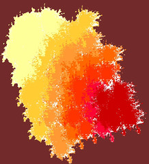
I then went back to My Digital Studio and used the Photo section to add that JPEG image repeatedly to the card, rotating it to fit around the Medallion stamp. It wasn’t exactly the look I originally wanted, but it was close—and I was no longer crashing the program.
Finally, I added additional Splatter stamps to the image to fill in empty spaces and correct places where the colors were not overlapping correctly. I found that the butter yellow color at the outside of the image was too subtle, so I stamped over it with the brighter yellow that you see in the card.
I ended up adding a bright yellow and black (Go Steelers!) punch, using the Modern Label Tag at the bottom. I added a Basic Black Grosgrain ribbon behind the Punch and Basic Black Brads to “hold” it in place.